Exploring Inflation Trends Using Snowflake’s Data Marketplace, and Zillow ZHVI
May 2023 and inflation is still the center of attention for all major news outlets. Inflation, my friend, is a beast that prowls through the economic landscape, it impacts both businesses and individuals. It’s this fickle indicator that has everyone on edge, constantly checking and reacting to every minute piece of information that comes their way. And maybe rightly so. But, that data analysis and interpretation pose challenges. The data available may not be comprehensive or representative, leading to volatile markets and rising uncertainty. Different metrics and indicators may provide conflicting views of the economy, making it difficult to gauge the true state of affairs.
Lately, I’ve been diving headfirst into various data tools to expand my knowledge and skill set. As I navigate that learning curve, I find myself delving into tangential interests, seeking to develop my own unique perspective. One such interest that has caught my attention is inflation. I’ve taken it upon myself to start from scratch, working with raw data and attempting to recreate the reported numbers. If you’re up for an exhilarating journey of data exploration and unraveling the intricacies of the economy. Let’s dive right in and see what’s up with inflation lately.
Data Collection
The Knoema Economy Data Atlas is a treasure trove of economic information. It’s like having an all-access pass to a vault of economic indicators from all around the world. Seriously though, there is a really wide range of datasets from inflation, GDP, employment rates, interest rates, rates rates, and more rates. So, if you feel so intrigued, check out Snowflake’s Data Marketplace and get it, it’s free as part of Knoema’s open datasets. You only need to first create an account with Snowflake (you can get a 30-day free trial).
Now, you might be wondering how to actually obtain that data. Snowflake is a cloud-based data warehousing platform that integrates with SQL. It provides a modern and scalable approach to managing and analyzing large volumes of data. Snowflake’s architecture allows for easy integration with SQL-based queries, making it straightforward to examine the tables and the database schema and construct your query, right? Well, sure I tried that. However, fortunately, I stumbled upon some usage examples right on the dataset’s homepage. Snowflake’s web interface for exploring database’s schema and executing queries.
1
2
3
4
5
// What is the US inflation over time?
SELECT * FROM "ECONOMY"."BEANIPA"
WHERE "Table Name" = 'Price Indexes For Personal Consumption Expenditures By Major Type Of Product'
AND "Indicator Name" = 'Personal consumption expenditures (PCE)'
AND "Frequency" = 'A' ORDER BY "Date";
Well, that certainly provided some assistance. At least now I have an idea of what I’m searching for. The Federal Reserve’s preferred measure of inflation, the Personal Consumption Expenditures (PCE) Price Index. The PCE Price Index is considered more comprehensive than other inflation measures, such as the Consumer Price Index (CPI), because it takes into account changes in consumer spending patterns over time. The Federal Reserve uses the PCE Price Index, specifically the PCE Price Index excluding food and energy, as a key indicator to assess inflationary pressures in the economy.
Enter ChatGPT (or should I say Genie AI). During my research, I stumbled upon an excellent article by Dan Galavan, which guides you through the process of setting up both the Snowflake Extension for Visual Studio Code and an intriguing extension called ChatGPT — Genie AI.
 VSCode Extension Marketplace — Genie AI Extnesion
This handy tool aids in database sleuthing by allowing you to give human-readable prompts for the data you seek, and getting back the corresponding query (or something quite close). With a few iterations and the convenience of executing these queries directly through the Snowflake extension:
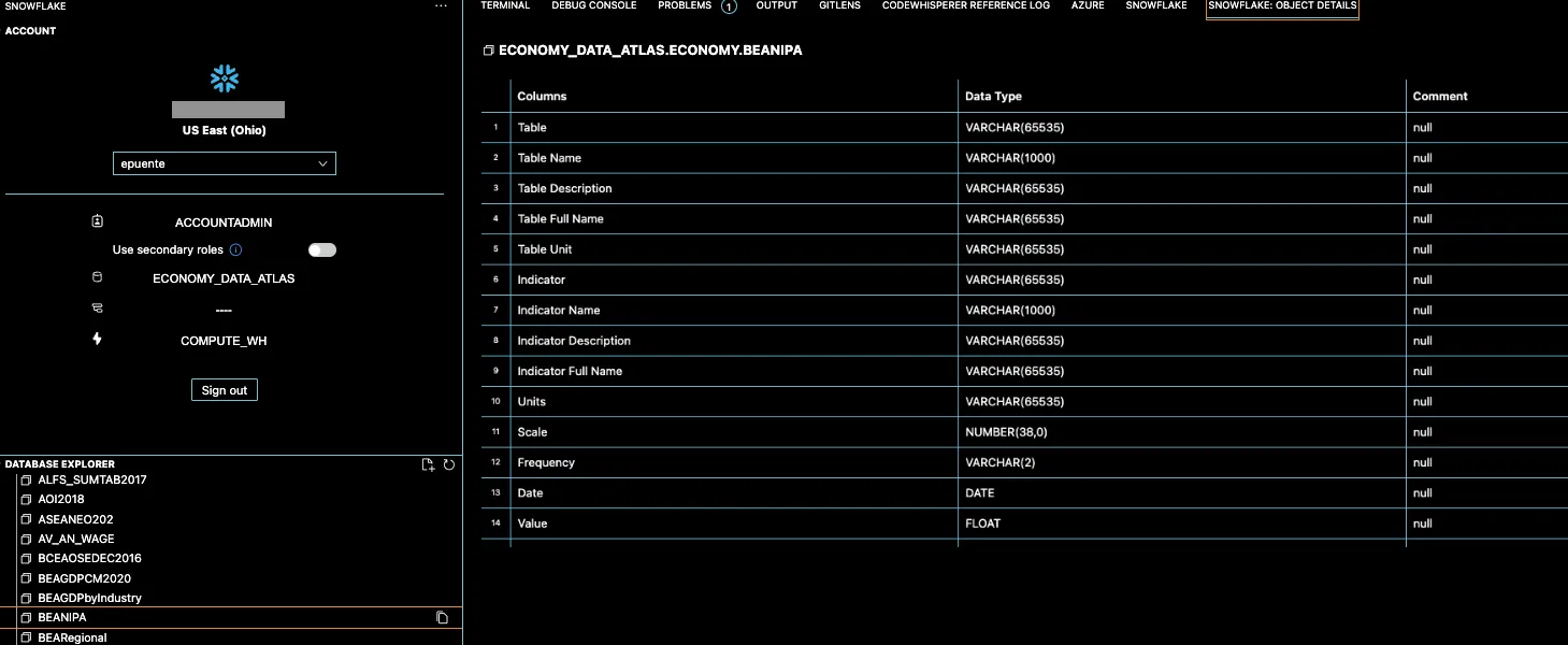 Snowflake’s VS Code interface for exploring database’s schema and executing queries.
It got me the query I was looking for in just a few minutes. Now just ask Genie to run that query in python (using Snowflake’s Connector for python) and you’ll likely get something like this:
1
2
3
4
5
6
7
8
9
10
11
12
13
14
15
16
17
18
19
20
21
22
23
24
25
26
27
28
29
30
31
32
33
34
35
import snowflake.connector
import pandas as pd

# create a connection object and cursor
conn = snowflake.connector.connect(
    user='XXXX',
    password='XXXXX',
    account='XXXXXX'
)
cursor = conn.cursor()

# execute the query and fetch the results
query = """
SELECT *
FROM "ECONOMY_DATA_ATLAS"."ECONOMY"."BEANIPA"
WHERE "Table Name" = 'Price Indexes For Personal Consumption Expenditures By Major Type Of Product, Monthly (M)'
AND "Frequency" = 'M'
AND "Indicator Name" IN (
  -- Previous query here, which returns a list of indicators
  SELECT DISTINCT "Indicator Name"
  FROM "ECONOMY_DATA_ATLAS"."ECONOMY"."BEANIPA"
  WHERE "Table Name" = 'Price Indexes For Personal Consumption Expenditures By Major Type Of Product, Monthly (M)'
  AND "Frequency" = 'M'
)
ORDER BY "Date" DESC
"""
cursor.execute(query)
results = cursor.fetchall()

# load the results into a Pandas dataframe
df = pd.DataFrame(results, columns=[x[0] for x in cursor.description])

# close the cursor and connection objects
cursor.close()
conn.close()
And that’s quite something. Now that we have a dataframe with the PCEs. We still need to maneuver that dataframe with a .pivot(), but that’s easy.
1
df.pivot(index='Date', columns='Indicator Name', values='Value')
 Price Indexes For Personal Consumption Expenditures By Major Type Of Product in a Dataframe.
Look at this dataframe spanning a whopping time frame from 1959 to 2023. Kind of scary to see the value of money dissolving into the ether. Just look at how Energy Goods and Services went from $8.50 to $111.68 in 64 years. A mind-boggling increase of 1212%! One can’t help but ponder how this will unfold over the next 64 years. Yeah, that allure of curiosity — it’s how to justify my indulgence in this data trek.
We’re now delving into the realm of Price Indices. These indicators are calculated using various methodologies and data sources to track changes in prices and consumer spending. While I won’t go into the specific calculation formulas used by the Price Indexes for Personal Consumption Expenditures, I can ask Genie what are these and how can we perceive them in everyday life:
- Durable goods. This indicator refers to long-lasting consumer products that are expected to provide utility over an extended period. Examples of durable goods include cars, appliances (such as refrigerators and washing machines), furniture, electronics, and other big-ticket items.
- Energy goods and services: This indicator focuses on energy-related products and services that consumers typically utilize. It includes items such as gasoline, electricity, heating oil, natural gas, and other energy-related expenses.
- Food: Kind of self-explanatory. Groceries, fresh produce, meat, dairy products, canned goods, and beverages.
- Goods: All consumer goods purchased in the market. It includes both durable and non-durable goods, such as clothing, electronics, household items, personal care products, and other tangible items intended for personal use.
- PCE. There are two kinds. The Market-based PCE which measures consumer spending in traditional markets with market prices, while non-market PCE includes government and non-profit services without market prices. Both provide good insights into consumer spending patterns.
Data Preparation
Now, off to the good stuff. How do we find the actual inflation? It’s really not that hard. It just involves comparing the price indexes of different time periods. We just need the percentage change in these indices, which represents the inflation rate. This calculation allows us to assess the rate of price changes in the overall consumption expenditures over time. Enter the Pandas library. For the percent change, we can simply use the pct_change() method, and just comes right away. We can also pass an argument for the period count that we want that percent change to be calculated from (ie. 12 for annual changes).
1
2
3
4
# Create a  new dataframe with Indicator names as columns and percent change as values and dates as index
mom_inflation = df.pivot(index='Date', columns='Indicator Name', values='Value').pct_change().fillna(0)
#Conver the index to datetime
mom_inflation.index = pd.to_datetime(mom_inflation.index)
1
2
3
4
yoy_inflation = df.pivot(index='Date', columns='Indicator Name', values='Value').pct_change(12)
yoy_inflation.index = pd.to_datetime(yoy_inflation.index)
yoy_inflation.sort_values(by=yoy_inflation.index[-1], axis=1, inplace=True, ascending=False)
yoy_inflation.tail()
 Annual Inflation Rates for Personal Consumption Expenditures.
Now that we have the monthly and annual inflation rates(ie. Food rose 8% from March 2022 to March 2023). We might be interested in knowing what the accumulated inflation over the last few years has been. That’s also relatively easy to find, but first a quick refresh on percent accumulation. Percentage accumulation over time is all about adding up those percentage changes and seeing how they stack up over a given period. It’s like a journey through time, where you’re tallying up all the gains and losses along the way. But here’s the kicker: a simple cumulative sum won’t cut it. You see, those percentage changes are all about relativity. They depend on where you started and how the changes stack up. This is because percentage changes are relative to the previous value, and when we sum them, the order in which the changes occur matters. For example, consider two consecutive percentage changes: +10% and -10%. If we simply add them up, the cumulative sum would be 0%, suggesting no change. However, in reality, we have a net loss of 1% (10% increase followed by a 10% decrease). To accurately calculate percent accumulation, we need to use compounding or multiplicative calculations. This involves multiplying the (1 + percentage change) for each period together and subtracting 1 to obtain the total accumulated percentage change. Here:
1
2
3
4
# Starting on 2018 accumulate the percent change and append a row with zero values for the first row
cum_inflation = ((1 + mom_inflation.loc['2018':]).cumprod() -1).fillna(0)
cum_inflation.sort_values(by=cum_inflation.index[-1], axis=1, inplace=True, ascending=False)
cum_inflation.tail()*100
 Accumulated Inflation from 2018 to 2023.
Data Integration
This is the part we spice things up a little. We’re about to add substance to these numbers and try to uncover some conclusions. We will be tying data together, hunting for some patterns, correlations, or just some validation. Let’s start with the obvious, interest rates. Supposedly, it’s the only lever our beloved FOMC has to control inflation. Or so they claim. I tried to find the data in the Economy Atlas, but no luck:
1
2
3
SELECT *
FROM "ECONOMY_DATA_ATLAS"."ECONOMY"."DATASETS"
WHERE "DatasetName" LIKE '%rates%';
 Result from Querying the DATASETS table for Datasets with “rates” as part of the name.
So, there are two options: 1. The trusty ‘Yahoo Finance (unofficial) API’ for some quick and easy access to the TNX which represents the 10-Year Treasury Note Yield, and the FVX that stands for the 5-Year Treasury Note Yield. These are the market yields of these respective government-issued bonds. 2. The actual Federal Funds Rate directly from our buddy ‘Fred from St. Louis’, you’ll need to signup for some keys but trust me it takes 2 minutes. Better yet, let’s include both. In a nutshell, TNX and FVX capture market expectations, while the Federal Funds Rate is determined by the FOMC.
1
2
3
4
5
6
7
8
9
10
11
12
13
14
15
16
17
18
19
20
21
22
23
24
25
26
import yfinance as yf
# Download the 10 year treasury rate from yfinance
tnx_df = yf.download('^TNX', start='2018-01-01', end='2023-05-01', progress=False)
# Download the 5 year treasury rate from yfinance
fxf_df = yf.download('^FVX', start='2018-01-01', end='2023-05-01', progress=False)
# Find the average rate by month
tnx_df_month = tnx_df[['Close']].groupby(pd.Grouper(freq='M')).mean()
fxf_df_month = fxf_df[['Close']].groupby(pd.Grouper(freq='M')).mean()
tnx_df_month.rename(columns={'Close':'10 Year Treasury Rate'}, inplace=True)
fxf_df_month.rename(columns={'Close':'5 Year Treasury Rate'}, inplace=True)
# Join the 2 dataframes
int_rates_df = tnx_df_month.join(fxf_df_month)
# Convert the date index to year - month format
int_rates_df.index = int_rates_df.index.to_period('M')

# Import the fred library
from fredapi import Fred
# Download the Federal Funds Rate from FRED
fred = Fred(api_key='XXXXXXX') #<---Your key goes here
fed_funds_df = fred.get_series('FEDFUNDS', start='2018-01-01', end='2023-05-01')
# Join with the int_rates_df for a single dataframe
int_rates_df = int_rates_df.join(fed_funds_df.rename('Federal Funds Rate'))

I’m getting ahead of myself here, but I need to share a chart here:

int_rates_df.plot(figsize=(12,5), grid=True, title='Interest Rates (2018 - 2023)')
I’m getting ahead of myself here, but I need to share a chart here:
1
int_rates_df.plot(figsize=(12,5), grid=True, title='Interest Rates (2018 - 2023)')
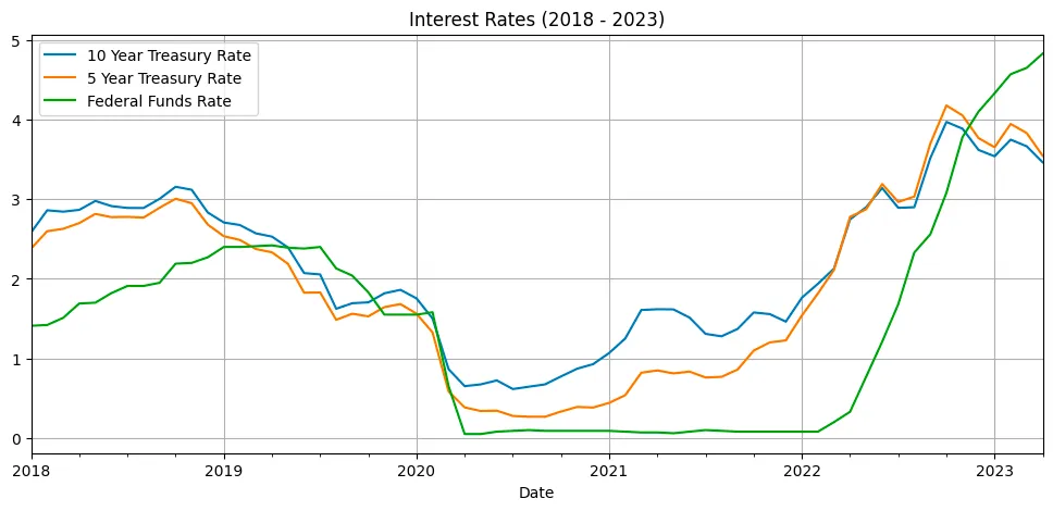 Rates Indices and Federal Funds Rate from 2018 to 2023.
So many thing to talk about here. But here’s the deal: rates indices often lead the Federal Funds Rate, acting as an early indicator. Changes in rates indices reflect market sentiment and can influence the FOMC’s decision-making process. The difference between rates indices and the Federal Funds Rate tells us how the market perceives future economic conditions. A significant difference suggests that market expects a potential change in the Federal Funds Rate down the line. In mid 2021 the market was already expecting a timely interest rates tightening, but everybody was too busy having fun with GME and AMC and other Stonks to pay attention. Now, it’s 2023 and the market is saying we are done here, time to lower those rates (not actually how this happens), but hope you get the point. The idea is that demand for those treasury bonds is high, moving the value up, pushing the yields (rates) down as the market thinks this type of rate won’t be around for much longer.
Moving on. I couldn’t resist using another dataset I’ve been abusing lately: the Zillow ZHVI, which tracks home prices across the United States, and the ZORI, which measures home rents. If you’re curious about how I obtained and combined them, check out my previous articles for the juicy details. The process this time was quite similar.
1
2
3
4
5
6
7
# Load All Homes CSV file
Neighborhood_Zhvi_AllHomes = pd.read_csv('Data/Neighborhood_zhvi_uc_sfrcondo_tier_0.33_0.67_sm_sa_month.csv',index_col=[5,7,8,6,2])
Neighborhood_Zori_AllHomes = pd.read_csv('Data/City_zori_sm_month.csv',index_col=[5,7,6,2])
# Take the columns that are dates
priceDates_df = Neighborhood_Zhvi_AllHomes.iloc[:,8:].T
priceDates_df.index = pd.to_datetime(priceDates_df.index)
priceDates_df.tail()
 Zillow’s Home Value Index by Region (neighborhood) at April 2023
The great thing about the Multi-Index Columns is that now we can filter or group by any of those levels (State, Metro, County, City). We can get the average inflation by state with the following line:
1
zhvi_timeseries_pct_1Y_by_state = zhvi_timeseries_pct_1Y.groupby(level="State",axis=1).mean()
 Average Home Price Inflation by State (April 2023)
Look at that, states like Alaska (AK), Colorado (CO), Connecticut (CT), have had still higher inflation rates, while states like Arizona (AZ), California (CA), and D.C. had comparatively lower inflation rates. I mean there is -4.2% disinflation from April 2023 to April 2022. But yeah, there is a general trend of declining inflation in home prices. This might suggest a potential slowdown in the growth of home prices.
Same thing can be done for the ZORI rentals data, to have both home prices and rents inflation in the same dataframe:
1
2
3
4
5
6
zori_timeseries = Neighborhood_Zori_AllHomes.T
dates = pd.to_datetime(zori_timeseries.index, errors='coerce').dropna()
zori_timeseries = zori_timeseries.loc[dates.strftime("%Y-%m-%d")]
zori_timeseries.set_index(dates, inplace=True)
# Convert dataframe to numeric
zori_timeseries = zori_timeseries.apply(pd.to_numeric, errors='coerce')
Now, here’s the catch. ZORI data is not as clean and consistent and ZHVI, there are some months where data is missing or bluntly missing a few decimal places so don’t get too frustrated if you have to interpolate or simply filter some columns. It’s time consuming so just take whatever looks good. Lastly. The time-date index includes the day number, which is not only useless but also problematic when trying to join monthly data. So, we’ll need to adjust the date index to ensure consistency on a monthly basis for all three data frames. It’s a minor hurdle, but nothing we can’t handle.
1
2
3
4
5
6
7
8
9
zori_1Y_inflation = zori_timeseries_interpolated.pct_change(12).dropna()
# Drop columns that contain more than one zero value
zori_1Y_inflation = zori_1Y_inflation.loc[:,(zori_1Y_inflation==0).sum(axis=0)<2]
zori_1Y_inflation_by_state = zori_1Y_inflation.groupby(level='State', axis=1).mean()
# Consistent month time index
zhvi_timeseries_pct_1Y_by_state.index = zhvi_timeseries_pct_1Y_by_state.index.to_period('M')
zori_1Y_inflation_by_state.index = zori_1Y_inflation_by_state.index.to_period('M')
yoy_inflation.index = yoy_inflation.index.to_period('M')
zori_1Y_inflation_by_state.tail()*100
 Average Rent Inflation by State (April 2023)
There is some consistency in the trends observed in both rental and home prices. In both cases, there is a general trend of declining inflation rates over time. But not a single disinflation number here. Regions seem to be correlated in prices and rents (ie. Connecticut is still hauling while California is playing modest). Rental price inflation tends to be higher compared to home price inflation. Alaska (AK): The rental price inflation in Alaska is consistently higher than the home price inflation. For example, in April 2023, the rental price inflation in Alaska was 9.3%, while the home price inflation was 2.4%. Colorado (CO): In Colorado, rental price inflation has been consistently higher than home price inflation. For instance, in April 2023, rental prices experienced an inflation rate of 4.53%, while home prices had an inflation rate of -1.335%.
To put it all together. I will just average every State for both ZHVI and ZORI. Sure, there are better ways of coming up with this “Prices” and “Rents” Indexes. But hey, I don’t have all day for this.
1
2
3
4
5
6
7
# Extract the relevant columns from each dataframe
df1 = yoy_inflation[['Personal consumption expenditures (PCE)']]
df2 = zhvi_timeseries_pct_1Y_by_state.mean(axis=1)
df3 = zori_1Y_inflation_by_state.mean(axis=1)
all_inflation = pd.concat([df1, df2, df3], axis=1)
all_inflation.columns = ['PCE', 'ZHVI', 'ZORI']
all_inflation.tail(12)*100
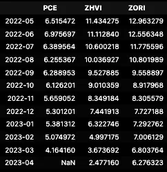 Inflation Rates for PCE, ZHVI, ZORI
That last dataframe is looking pretty good. Too bad we don’t have the print for PCE in April in this dataset, but you can already see what that is here not going to spoil it for you. Let’s roll up our sleeves and dive into the visuals, making sense of the connections, and adjusting where needed. Time to bring some shapes to these numbers.
Visualization
There’s a lot to be said about plotting data. I am not going to make this a visualization post. There are plenty of those and way more comprehensive than what I am trying to achieve here. So, I am going to make it simple for you dear reader. In pandas, the .plot() method provides a super convenient way to generate various types of plots directly from the dataframe. It is a wrapper around the matplotlib library, which is a powerful plotting tool in Python. The .plot() method allows you to create line plots, bar plots, scatter plots, histograms, and more with just a single line of code. Here’s how it works: you can call the .plot() method on a DataFrame or a specific column of the DataFrame, and it will automatically generate a plot based on the data. For example:
1
yoy_inflation.loc['2015':].plot(figsize=(21,7), grid=True, title='Year over Year Percent Change')
Returns this: 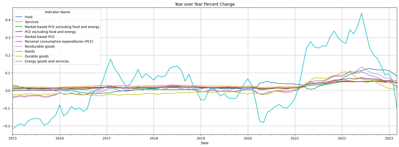 Year over Year Inflation For Personal Consumption Expenditures By Major Type Of Product
Wild oscillations in Energy Goods and Services. Wild +40%, after having negative oil prices in mid 2020. It’s almost as if having an oil cartel manipulating supply is not ideal for price stability. The rest of the indicators dwarf in comparison and it’s hard to read how those are changing over time.
Finally, let’s talk about ax = plt.gca(). In matplotlib, gca() stands for “get current axes.” By assigning ax to plt.gca(), we obtain a reference to the current axes object, which represents the plot that is being created. This allows us to modify and adjust various aspects of the plot. Once we have the ax object, we can use its methods to customize the plot further. For instance, we can set the x-axis and y-axis labels, change the title, adjust the colors and styles of the lines or bars, modify the tick marks and tick labels, and so on. Essentially, ax gives us fine-grained control over the appearance and properties of the plot.
Let’s start with year-over-year inflation. Just using the plot() and the plt.gca() methods we can adjust the ticklabels to change the fromat to percentage or add a straight line to show the inflation target. Now, let’s remove the Energy component and make some formatting adjustments. We’ll add labels indicating the values at each peak for every category.
1
2
3
4
5
6
7
8
9
10
11
12
13
14
15
16
17
18
19
plotdf = yoy_inflation.iloc[-61:,:-1]
plotdf.plot.line(figsize=(21,7), grid=True, title='Year over Year Inflation For Personal Consumption Expenditures By Major Type Of Product\n (2018 - 2023)', alpha=0.5, marker='*', markersize=7)
# Change y axis format to percent
ax = plt.gca()
vals = ax.get_yticks()
ax.set_yticklabels(['{:,.0%}'.format(x) for x in vals])
# If the highest value is greater than 6%, add a label with the value in percent format and the date.
for col in plotdf.columns:
    if plotdf[col].max() > 0.06:
        # Get the date of the highest value
        date = plotdf[col].idxmax().strftime('%Y-%m-%d')
        # Get the highest value
        val = plotdf[col].max()
        # Add a label to the plot
        plt.text(date, val, '{:,.0%}'.format(val), fontsize=12)
# Add a horizontal line at 2%, with the label '2% Inflation Target'
ax.axhline(y=0.02, color='r', linestyle='--', label='2% Inflation Target')
ax.legend(loc='upper left', fontsize=12)
plt.show()
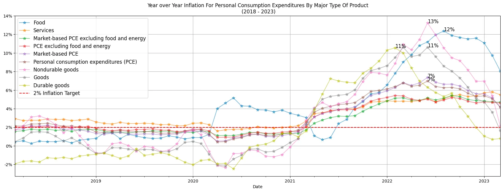 Year over Year Inflation For Personal Consumption Expenditures By Major Type Of Product (2018 - 2023)
The revised chart not only appears more appealing but also presents the values in a percentage format, which is more comprehensible to most individuals compared to the previous decimal representation. Non-durable goods and Food had a really strong uplift in mid 2022.
Let’s take it a step further. This time, we’ll use a bar chart as an alternative for those who struggle with reading line plots. This choice is justified because this data reflects year-to-year price changes rather than cumulative inflation. Think of it as the velocity of prices, not their actual position.
1
2
3
4
5
6
7
8
9
10
11
12
13
14
15
# Group by quarter and calculate the average per group
plotdf = yoy_inflation.iloc[-61:,:-1].groupby(pd.Grouper(freq='Q')).mean()
plotdf.plot.bar(figsize=(21,7), grid=True, title='Year over Year Inflation by Quarter for Personal Consumption Expenditures By Major Type Of Product \n (2018 - 2023)')
# Change y axis format to percent
ax = plt.gca()
vals = ax.get_yticks()
ax.set_yticklabels(['{:,.0%}'.format(x) for x in vals])
# Change x axis labels to dates and show the month name and year
labels = [item.get_text() for item in ax.get_xticklabels()]
labels = [pd.to_datetime(x).strftime('%b %Y') for x in labels]
ax.set_xticklabels(labels)
# Add a horizontal line at 2%, with the label '2% Inflation Target'
ax.axhline(y=0.02, color='r', linestyle='--', label='2% Inflation Target')
ax.legend(loc='upper left', fontsize=12)
plt.show()
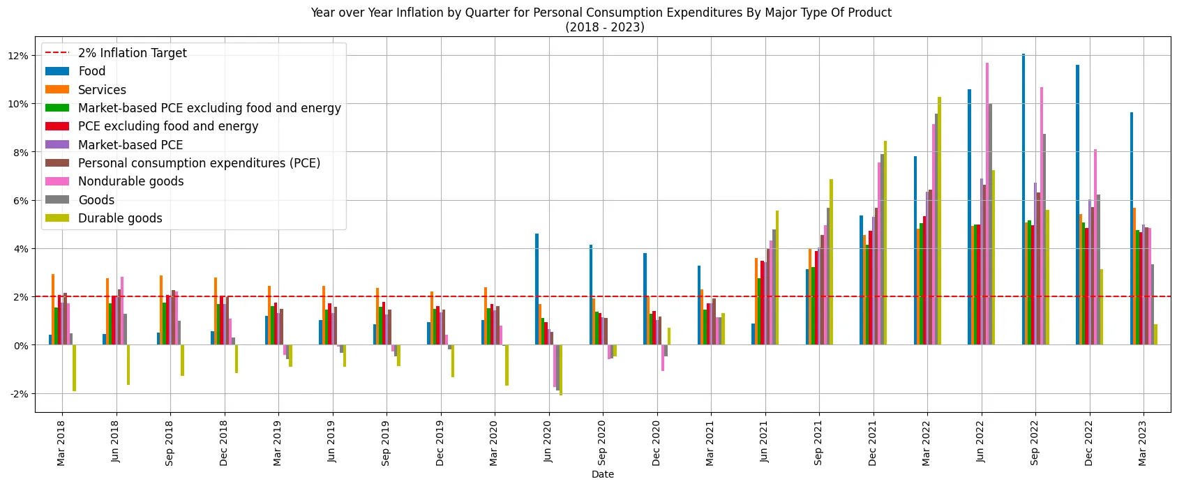 Year over Year Inflation by Quarter for Personal Consumption Expenditures By Major Type Of Product (2018 - 2023)
Next, we’ll examine the accumulated inflation of prices, offering a snapshot of the current price position relative to five years ago, pre-COVID and prior to the anticipation of interest rate hikes.
1
2
3
4
5
6
7
8
9
10
11
12
13
14
15
16
# Remove 'Energy goods and services' from the columns
plotdf.drop('Energy goods and services', axis=1, inplace=True)
plotdf.plot.area(figsize=(21,7), grid=True, title='Cumulative Inflation for Personal Consumption Expenditures By Major Type Of Product \n (2018 - 2023)', stacked=False, alpha=0.8)
# Change y axis format to percent
ax = plt.gca()
vals = ax.get_yticks()
ax.set_yticklabels(['{:,.0%}'.format(x) for x in vals])
# Add a legend for "Market-based PCE" with the value at the begining of each year.
# Get the dates for the begining of each year
dates = [x.strftime('%Y-%m-%d') for x in plotdf.index if x.month == 1]
# Get the values for the begining of each year
vals = [plotdf.loc[x,'Market-based PCE'] for x in dates]
# Add a label to the plot
for i in range(len(dates)):
    plt.text(dates[i], vals[i]*1.1, '{:,.0%}'.format(vals[i]), fontsize=14, color='r')
plt.show()
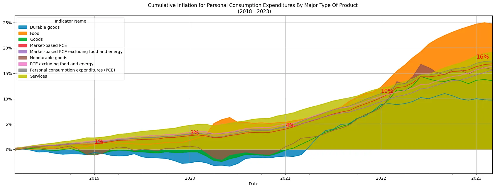 Cumulative Inflation for Personal Consumption Expenditures By Major Type Of Product (2018 - 2023)
That’s actually pretty interesting. Inflation is creating all this mental havoc and interest rate hikes are about to tank the economy, but it’s only 16% over the last 5 years?! That is a bit over ~3% a year. Is that really that bad? Well, here’s the thing. A 4% inflation rate over the initial three years indicates a relatively stable and moderate price environment. However, the subsequent jump to a 16% inflation rate in the following two years is the problem. This rapid inflationary surge can have far-reaching effects on people and the overall economy. It’s like watching your savings slip through your fingers. You know all that that FUD. This is why central banks and policymakers are taking action, tweaking rates and monetary policy. However, there are also consequences for overall economic stability, read SVB (Silicon Valley Bank) and FRC (First Republic Bank).
Speaking of interest rates, it’s time to delve into the final part of this, the heart of the matter. The chart that encompasses inflation, interest rates, and home prices. This is the moment you’ve been waiting for.
1
2
3
4
5
6
7
8
9
10
11
12
13
14
15
16
17
18
plotdf = all_inflation_int.loc['2018':]
plotdf.plot.line(figsize=(21,7), grid=True, title='PCE Annual Inflation and Interest Rates\n (2018 - 2023)')
# Change y axis format to percent
ax = plt.gca()
vals = ax.get_yticks()
ax.set_yticklabels(['{:,.0%}'.format(x) for x in vals])
# If the highest value is greater than 6%, add a label with the value in percent format and the date.
for col in plotdf.columns:
    # Get the date of the highest value
    date = plotdf[col].idxmax().strftime('%Y-%m-%d')
    # Get the highest value
    val = plotdf[col].max()
    # Add a label and date to the plot
    plt.text(date, val+0.002, '{:,.0%} in {}'.format(val, date), fontsize=10)
# Add a horizontal line at 2%, with the label '2% Inflation Target'
ax.axhline(y=0.02, color='r', linestyle='--', label='2% Inflation Target')
ax.legend(loc='upper left', fontsize=12)
plt.show()
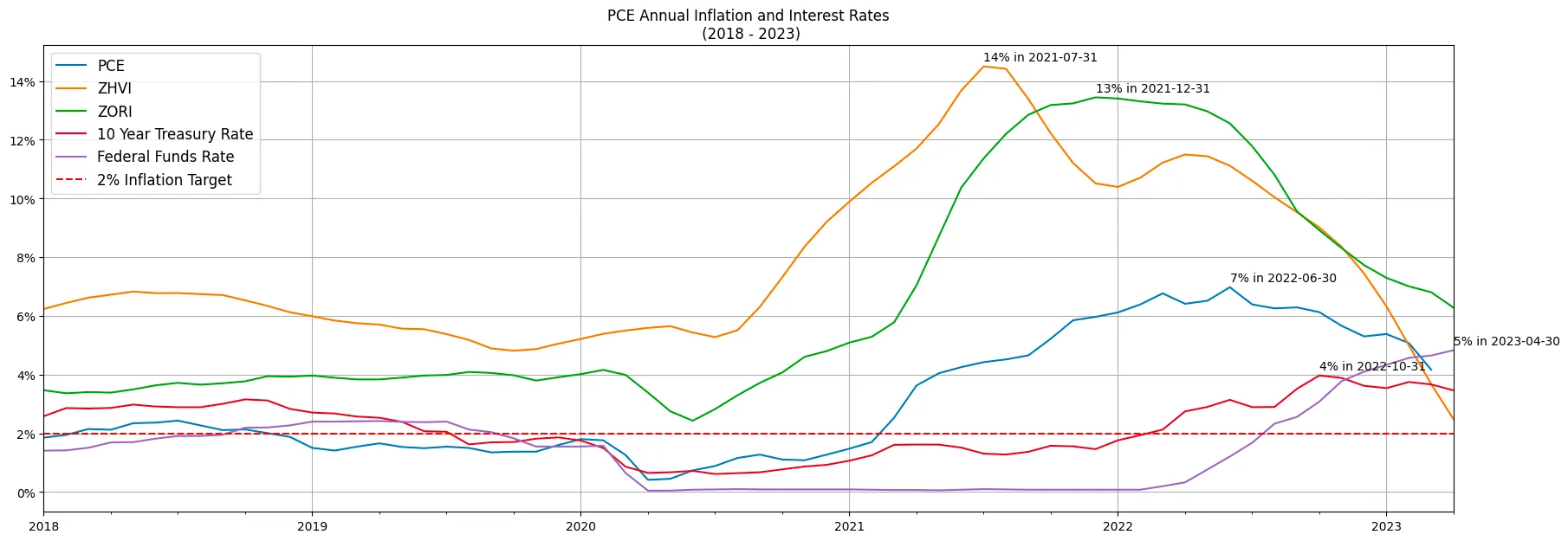 PCE Annual Inflation and Interest Rates (2018 - 2023)
Ta-da! Not impressed?! 😅
Seriously though. There’s again a lot to unpack from this chart:
- Home prices’ inflation peaked in mid 2021 for the average home in the country. Based on ZHVI, 14% was the top in July 2021 and interest rates had not started moving yet.
- Then came rents at 13% YoY in December 2021 and had kept since steadily slowing down. But not as fast as prices. Now rents are at ~6% YoY, and Home Prices are approaching 3% YoY.
- Finally, the PCE. The FEDS’ favorite inflation metric seem to have peaked in June 2022 at 7%. So no disinflation of course, but at least is getting tamed. We are now sitting right above the 4%, still twice as much as the goal of 2% form the FED. But if we all agree this indicator is lagging the home prices and rents, maybe indeed the FED should stop the rate hikes and try to get to that “soft-landing”.
Conclusion
We started by exploring the technological background that enables this type of analysis. Snowflake is the data cloud and its compatibility with SQL makes it easy to leverage SQL skills while taking advantage of the powerful and scalable data warehousing capabilities. But is that Data Marketplace feature that makes it very continent to consume and share data. This was a more “static” analysis, but this can be done as data pipeline having a system designed to process and execute activity based on timely data sources.
Then, we shifted gears and analyzed year-over-year inflation in the PCE (Personal Consumption Expenditures) index, the Federal Reserve’s preferred measure of inflation. Then complemented that data with home prices and rental data across different states. Interestingly, we found that home prices seem to be the leading indicator for inflation and are indeed slowing down. It’s a fascinating trend that challenges some of our assumptions. The PCE has accumulated a 16% inflation over the last five years, but is the last three years that have quite a substantial jump! This shift indicates a significant acceleration in inflation over the later period. It suggests that the pace of price increases intensified but now seems to be slowing down.
The current economic situation is characterized by uncertainty and weirdness. Everyone is reacting to minute-by-minute information, creating a sense of overreaction. Now, let me tell you something: while analyzing inflation trends can offer some valuable insights into the state of the economy, we mustn’t let it consume our brain energy. We’re bombarded with data and predictions, drowning in a sea of numbers and charts, as if our lives depend on every decimal point. It’s easy to get caught up in the frenzy, losing sight of the bigger picture. So, my friend, take a step back, breathe, and remember that life is more than just the latest inflation rates. Let’s make our decisions based on what truly matters, not just the whispers of this ever-fluctuating beast.
I would recommend reproducing this charts. After all we have this powerful plugins that make half or more than half the work for you.
Thank you for making it this far.
Hope you enjoyed reading this as much as I did making it.
Please consider subscribing.

