The State of the Housing Market: Using Pandas to analyze housing prices
Do you think you know how the housing market is doing? Would you like to know where are the highest or lowest prices in the Country, State, County, City? How about, how have prices raised (or dropped) in the last few months in your area?
In this article, I will explore how to use the Pandas Library in Python to analyze prices across regions in the US. I will cover the basics from importing, indexing and basic returns calculations with the ZHVI data. I will also show how to perform a quick statistical analysis and visualize the results. Whether you are a real estate professional, a data scientists, or simply curious about what I have to say about the housing market, this article can be of your interest. I’ll show some simple tools to help you get another perspective about the ever changing conditions of the market.
Pandas — Panel Data ;) is a powerful tool that can help you analyze multi dimensional structured data. It’s basic building block is the dataframe, a data structure that stores and makes it easy to manipulate data. It’s similar to a table in a relational database or a spreadsheet, with rows and columns that can be indexed and labeled.
About two years ago I posted my first article on Medium, part of a Data Science course. Sure, prices were lofty and everyone was saying that a correction was coming soon. Well, probably the fastest growth in value in RE happened over these last years. Clearly nobody knew the money floodgates were about to be opened and people were going to be buying the “ownership” of ape jpegs for thousands of dollars. You would expect the more tangible assets like scarce houses would be impacted as well. Anyway, I thought of refreshing that analysis with current data and refresh some of those skills I learned.
Downloading and Importing Data
You can find and download the most recent data from the Zillow website. They have details and even a user guide on how to use the data. You should explore the site.
I selected the view or “cut” to be by neighborhood to get the more granular data and then we can aggregate by city, metro, county, etc.
The Zillow Home Value Index (ZHVI) is a smoothed, seasonally adjusted measure of the typical home value and market changes across a given region and housing type. It reflects the typical value for homes in the 35th to 65th percentile range.
Make a note of the word typical. This is not to be confused with the median, but I would infer this to be the mean value of prices. This means we re getting the most “average” home’s price in the area by taking the middle tier of prices and correcting for seasonal oscillations throughout the year.
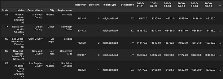
Once we have downloaded the .csv file, getting it into Python is really just one line. We obviously need to import the Pandas library first, and then use the pd.read_csv() method to create the dataframe. There are some optional parameters that you can use to customize the way the CSV file is read, such as specifying the separator character, the encoding of the file, and the names of the columns. We will only use the index_col parameter specifies which column(s) in the CSV file should be used as index/indices. The index is a special column in a DataFrame that identifies each row and is used to access and manipulate the data in the DataFrame. This is how you will be querying, or retrieving, data from the dataframe.
1
2
3
import pandas as pd
Neighborhood_Zhvi_AllHomes = pd.read_csv('Data/Neighborhood_zhvi_uc_sfrcondo_tier_0.33_0.67_sm_sa_month.csv',index_col=[5,7,8,6,2])
Neighborhood_Zhvi_AllHomes.head() # Getting the first five rows of the df
This worked alright. We can now access the data by selecting the State, the Metro are or the City. This is done through a special kind of index, the Multiindex, also known as the hierarchical index. Which is a way to represent data with multiple levels of indexing in a DataFrame. It makes the code more efficient for certain operations, such as filtering and joining.
Creating a time series dataframe with MultiIndex Columns
The last layout is not ideal for a time series, as the time index is in the columns axis, which is not the primary axis. So I will transpose the dataframe applying the .T method after the dataframe. I will also convert the strings holding the dates to a proper datetime object. Hope the rest of code is self explanatory:
1
2
3
4
5
zhvi_timeseries = Neighborhood_Zhvi_AllHomes.T
dates = pd.to_datetime(zhvi_timeseries.index, errors='coerce').dropna()
zhvi_timeseries = zhvi_timeseries.loc[dates.strftime("%Y-%m-%d")]
zhvi_timeseries.index = pd.to_datetime(zhvi_timeseries.index, errors='coerce').dropna()
zhvi_timeseries
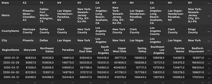 Time series Dataframe for home prices with MultiIndex Columns Names
That’s much better. We can see the prices for the first few months on the data set. Like $397,721 in the Upper West Side, NYC in January 2000. Just out of curiosity let’s see what that is today. Easiest way to do that would be using the .tail() method, which can take an argument of how many rows we would like to see.
1
zhvi_timeseries.tail(3)
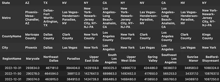
The same “typical” home in the Upper West Side in December 2022 reached $1,488,480. Which, by the way, seems to have dropped from $1,496,677 in October. Hang in there I am getting somewhere with this.
Calculating Returns from Price Values
You may be wondering how much really have the prices changed over the past few years. Maybe wondering if the housing market is really cooling down as some data suggests. I’ll show you how to calculate the monthly returns for these prices in just one line. The pct_change() method calculates the relative change in values over time or between columns, depending which axis we decide to use as reference.
1
2
zhvi_timeseries_pct = zhvi_timeseries.pct_change()
zhvi_timeseries_pct.tail()*100
Okay. Admittedly, monthly returns are really not that interesting. In fact some people argue that not knowing the daily, monthly in our case, value of RE property helps keep the market relatively stable.
Not having a “ticker” on the value of houses is beneficial because it can prevent the market from making impulsive decisions based on short-term fluctuations in the market.
This aligns with the long-term investment thesis, where value of assets will increase over time, even if it experiences temporary dips. However, this level of granularity allows for trend analysis and comparison with other markets and even other investment instruments. A couple of things we can do to make this data more sensible are: 1. “Annualize” monthly returns. This is extrapolating the performance from a short period of time over a full year. The most common way to annualize monthly returns is the compound annual growth rate (CAGR): CAGR = (End Value / Start Value)^(12 / n) — 1
1
100*((1+zhvi_timeseries_pct).pow(12)-1)
Still not very revealing, but IMO at least gives a better idea of the magnitude of the declines over the last few months. Steep declines in September and October, slow-down in November and December. 2. Use the pct_change() method again, now using 12 periods as argument. This will give us the year over year (YoY) returns for each period (month).
1
zhvi_timeseries_pct_yoy = zhvi_timeseries.pct_change(12)
 Year-over-Year Return on Houses at December 2022
Even with the alleged “cool down” the Northeast Dallas area gave a meager 10.79% return over the last year December 2021 through December 2022. That is down from almost 20% from August to August in same years. Maybe folks from Dallas can attest to this in the comments 😉.
One last method to tie this together is cumulative sum, cumsum(). This will return the same columns and rows, but the values will be accumulated over each period. There is a caveat though, you can’t simply add simple returns.
Simple or arithmetic returns do not account for compounding, which can lead to a distortion of the true return over longer periods of time. Additionally, they can be affected by large fluctuations in the price of an asset, leading to large positive or negative returns. Log returns, also known as continuously compounded returns are commonly used to calculate returns over a longer period of time, such as a year or a decade. They are more accurate than simple returns because they account for compounding and are not affected by large fluctuations in the price of an asset. Additionally, log returns are useful in mathematical analysis because they are additive and have many desirable properties like Gaussian distribution, which is useful in statistical analysis.
TLDR; use Log returns. These can also be done quickly by just taking the log() of the simple returns, but makes more sense to start showing some graphical representation of this data:
1
(np.expm1(np.log1p(zhvi_timeseries_pct.iloc[-12*3:,:10]).cumsum())*100).plot(grid = True, figsize = (18,7),linewidth = 2)
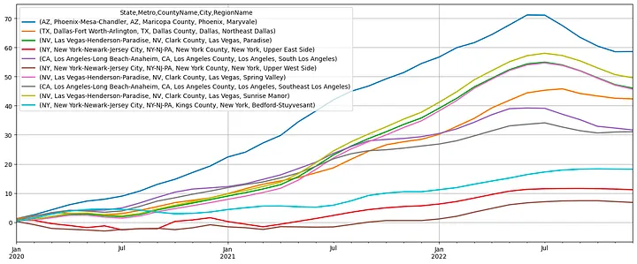 Cumulative Returns January 2020 to January 2023
There it is! The housing market is cooling down… or is it? From January 2020 to January 2023, the Sunrise Manor in Las Vegas has rose 50% in value, that’s after the latest ~10% decline. Or Maryvale in Phoenix with 60%, down from 70%+, in just three years! I hope you are starting to see some value in this. These are quick, one line commands you can use to generate these plots+calculations. Clearly pretty basic, but my intention is showing the code efficiency from using this library.
These are just the returns over the estimated equity of the typical house on these neighborhoods. We would need to account for taxes, insurance and any other operating expenses and income from rental of the property. Obviously beyond the scope of this post.
Indexing and Grouping with MultiIndex
If you are still following you may be wondering what this graph looks like in your area. Indexing (selecting) data in this dataframe is going to be pretty easy after the layout we gave it. Pandas uses two methods to index the data .loc() and i.loc(). The first is used to select data by label. For example, if you want to select the row with data from “2021–12–31”, you can use the following code:
1
zhvi_timeseries_pct_yoy.loc['2021-12-31']
 Year-over-Year Return at December 2021
The iloc() method is used to select data by integer index, which means that you can use it to select rows and columns by their numerical indices. For example, if you want to select the last row of a dataframe, you can use the following code:
1
zhvi_timeseries_pct_yoy.iloc[-1]
 Year-over-Year Return at December 2021
We can use a combination of both to work in rows and columns:
1
zhvi_timeseries_pct_yoy.iloc[-1].loc[('CA','San Jose-Sunnyvale-Santa Clara, CA')]
First, iloc() is used to select the last row of the dataframe. Then loc() is used to select the columns by their index label, so[('CA','San Jose-Sunnyvale-Santa Clara, CA')] is selecting the specific column where the labels ‘CA’ and ‘San Jose-Sunnyvale-Santa Clara’ intersect.
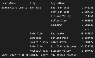 Yer-over-year percent change in value in San Jose, Sunnyvale and Santa Clara Cities
The cool thing about this results is that we can keep manipulating the data to produce other results with methods that can be executed as properties of the dataframe, like sort_values(). Let’s try one more to find which were the regions in California that had the highest appreciation over the last year.
zhvi_timeseries_pct_yoy.iloc[-1].loc[(‘CA’)].sort_values(ascending=False).head(10)
 Regions in California with highest appreciation over 2022
Not bad Gene Autry in Palm Springs, 25.5% over the last year. Wonder if it has anything to do with the explosion of golf over the last few years. Or maybe the significant amount of people retiring.
The last method I’d like to show you is groupby(). This one is powerful because it helps to easily summarize large amounts of data by grouping it into smaller, more manageable chunks. Think of it like sorting a pile of items into different groups based on a specific criteria, then you can perform some action on each group separately. For example, we can now group the time series by State, County or City. Then calculate the average price, or returns, or any other arbitrary calculation over the group of data under that classification.
1
zhvi_timeseries_pct_yoy.groupby(level='Metro', axis=1).mean().sort_values(by='2022-12-31', axis=1 ,ascending=False).iloc[:,:5].tail()
I just grouped the dataframe by the label ‘Metro’, which stands for metropolitan area, and then applied the mean() method to calculate the average of all the values that fell under the under the distinct metro labels. The axis=1 argument only means that the grouping will be performed over the columns axis, rather than the rows (axis=0). Because the columns hold the information about the different geographic groups or categories.
 Last five months of the top performing Metropolitan Areas in the US
Naples, Florida seems to be the Metro area with the highest appreciation over the last year with ~31% YoY growth. Oddly, Barre in State of Vermont (full disclosure first time I hear about this place) follows with ~26%. Maybe, this brings some suspicion about the limitations/biases in this analysis. Just in case you are curious about the nature (distribution) of this data, I’ll show one last function that can help in these cases. The describe() method, which calculates the summary statistics of the data. It’s a quick way to get a sense of the distribution of the data, it usually includes measures of central tendency (mean, median, mode) and measures of dispersion (standard deviation, minimum and maximum values, and quartiles).
1
2
3
4
5
6
# Calculate the mean for year over year returns for every metro are and select the top5.
top5_metro = zhvi_timeseries_pct_yoy.groupby(level='Metro', axis=1).mean().sort_values(by='2022-12-31', axis=1 ,ascending=False).iloc[:,:5].tail()
# Extract the labels for the top 5 metros
metro_labels = top5_metro.columns.get_level_values('Metro')
# Use the last date in the prices dataframe and the labels from the top 5 metros to describe the dataframe
zhvi_timeseries.iloc[-1].loc[slice(None),metro_labels].groupby(level='Metro').describe()
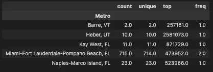 There are only two neighborhoods in Barre, VT.
Yes, only two neighborhoods in the Metro area of Barre, Vermont. Takeaway. Clean your data first (duh!). Maybe including a Metropolitan area with only two neighborhoods is not the right approach for comparing this group. But also, why are houses in Barre at $257k in 2023? Is there maybe only one house per neighborhood? 🤔
I started by saying how I did a similar analysis almost three years ago. I’ll leave you with a chart that shows the states that had the strongest appreciation over the last three years. Admittedly, this chart requires a few more lines of code than what was shown here. Feel free to check out the rest of the code on the gtihub repo below.
1
2
3
4
5
6
top6statesbypct = zhvi_timeseries.groupby(level='State',axis=1).mean().pct_change(periods=12*3).iloc[-1].head(6).sort_values(ascending=True)
barplot_by_location(
    top6statesbypct,
    axisformat = 'pct',
    title='3-Year Change in Home Prices by State @ December 2022'
    )
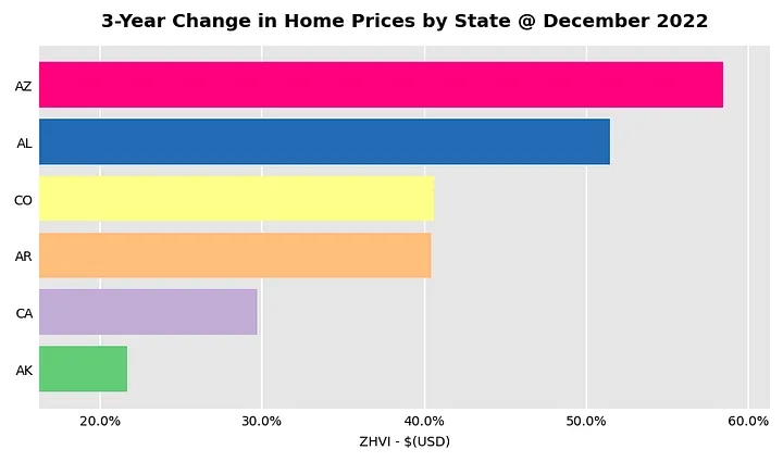 Three-Year Change in Prices by State at December 2022.
Somebody please explain what is going on in Alabama. Just for reference and with the risk of encouraging the RE crowd I’ll add a screenshot with the S&P500 ETF from Fidelity, the SPY. 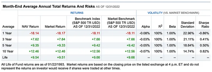 https://screener.fidelity.com/ftgw/etf/goto/snapshot/performance.jhtml?symbols=SPY
😬 +7.62% in the same three year time frame. So, what comes next? Does the housing market catches up/down with the stock market? Or the stock market bounces back first? Rents, seem to be slowing down, and the affordability of a home is at all time low with mortgage payments reaching 40% of annual household income. Not very sustainable IMO. The housing market plays a crucial role for the economy, and its fluctuations can have significant consequences. I’ll leave it at that. Hope you found this useful. Let me know what I missed or what else would you like to see from this data.
Thanks for Reading!
You can also find this article on Medium, please consider subscribing.
Yours,
Enrique 🖖.


